We’ve got some exciting news here at the Conservancy — our brand has a fresh new look!
We are excited to unveil our new brand, which includes a new logo, an alteration of our current logo, and new colors. Although all of these elements make up the look and feel of an organization, a brand encompasses so much more than this. To us, the Conservancy brand is a combination of how we define ourselves and how the community defines us. We want to be sure that our visual identity reflects the mission, values, and personality of the Conservancy.
While the Conservancy is growing and evolving, our mission stays the same: to enrich lives and our communities by inspiring use, appreciation, and support of our national park and ensure its preservation.
So, now that we’ve successfully got you on the edge of your seat, we’re ready to show you the final products! Drumroll please…. ![]()
Pretty snazzy, right? Here is what makes it a good logo:
- The circular shape is a more contemporary and stylish design. It is also more flexible in spaces that are less horizontal.
- The “C” in the middle uses font from our old logo, so it brings some familiarity. The “C” also draws your focus to the Conservancy as the primary element.
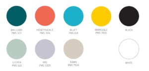
- Our new color palette will help distinguish the Conservancy from the National Park Service.
Our current logo was also adjusted to fit the new brand to use in places where the circular logo just doesn’t fit properly (for instance, on a pen). The key changes that were made on this one include an alternation of the “N” for a smoother read as well as a more legible and cleaner “FOR”.
Check out the before and after:
You might be wondering — how did this all come together? It started with a “brand workshop” with our graphic designers over at Agnes Studio. In this brand workshop, we made a list of all the words that come to mind when we think of the Conservancy. Some of the words we came up with were:
- Nouns: health, wellness, environmentalist, activist, advocate, change-agent, facilitator, resource, liaison, leader
- Adjectives: aware, transformational, nimble, edgy, creative, resourceful, innovative, passionate, experiential, diverse, community-oriented, inspiring, growing
- Verbs: activate, enhance, connect, conserve, protect, educate
After thinking about our core mission, our community, and the values we stand for, it was time to bring it all together. From here, our designers worked to figure out how to best convey our personality in a logo. They tried several versions of the round logo with leaves, trees, and other images in the center of the circle, but none felt right. A single pictorial element could not convey all that the Conservancy does.
After rounds of edits, we decided to simply choose a “C”. Not only does “C” stand for Conservancy, but it can also stand for the connections we make for people to the park, or the community we bring together.
So, what do you think? Our goal was to develop a strong, recognizable, and memorable Conservancy brand. We hope that this logo is a visual language that empowers and inspires you to invest, explore, and love our national park.
We’d love to hear your thoughts. Drop us a note at info@forcvnp.org